Best practices for creating a successful Web Story
A Web Story is a full-screen visual storytelling experience that conveys information with images, videos, graphics, audio, and more. It's perfect for users who want bite-sized, visually-rich content.
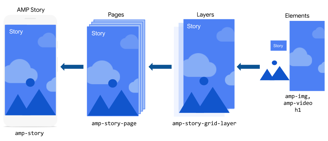
The basic ingredients that go into a Web Story are individual pages. These pages, in turn, are composed of individual layers that contain basic HTML and AMP elements.
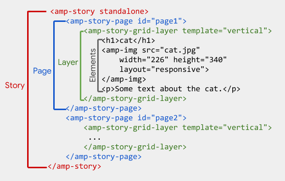
Each of those ingredients are translated into AMP components, where the story is represented by amp-story, the page is represented by amp-story-page, and the layers are represented by amp-story-grid-layer.
Let's start creating our Web Story with the amp-story container.
https://youtu.be/Zv6PY1BQLBE?si=alL0QKgDDOrLFwfJ
Create your first Web Story
Starting our story
An entire Web Story is represented by the amp-story component, which serves as a container for all the pages in a story. The amp-story component is also responsible for creating the UI shell, including handling gestures and navigation.
The amp-story
component is a custom AMP component, and like all custom components,
you must add the associated script for the component to the AMP
document.
Open the pets.html file in your text editor, and in the <head> section, add the following script:
<head> <script async custom-element="amp-story" src="<https://cdn.ampproject.org/v0/amp-story-1.0.js>"></script> </head>
Add the <amp-story> element to the <body> of your document, and specify the mandatory standalone attribute, like so: